Hello. I recently learned how to use the aggregate function, and realized its great importance in creating sampling distribution.
Anyway, the idea is to use a simulator to generate random data for each student. I think each student is going to get 5 simulated data numbers. Of course, I used join functions to combine all of those inputs to become part of one big list, and then made a dotplot based on this big list.
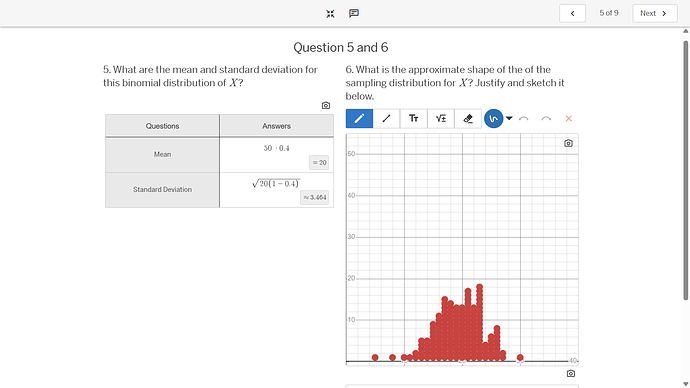
When the data were whole numbers, the dotplot was perfect. We got the perfect result. However, when we converted them into proportions (I believe the first data was a simulation for many of a specific thing can be drawn (x) out of n elements, and thus the proportion of getting such a thing is x/n. It was the dotplot for this one which was a disaster.
Here are some screenshots of the important slides:
This image was for when data collected were whole numbers.
After converting the data into proportions, and using dotplot, the data is now shown like this.
This is the activity I made:

