I want to create a bar graph from multiple student entered data. Each student will run a simulation 10 times and I want them to record their wins and losses. I then want a bar graph the displays the total number of wins and losses for everyone in the class. I was imagining they could enter an L or W into a table with 10 entries and create a bar graph from that data. Is this possible?
I think this should help: You can use this historgram function to translate a table into a bar graph, or basically any plot you want.
Yeah, I’ve always found aggregate a little tricky when the data isn’t naturally numeric.
I put together a small example which might be something like you’re looking for? You can find the activity here
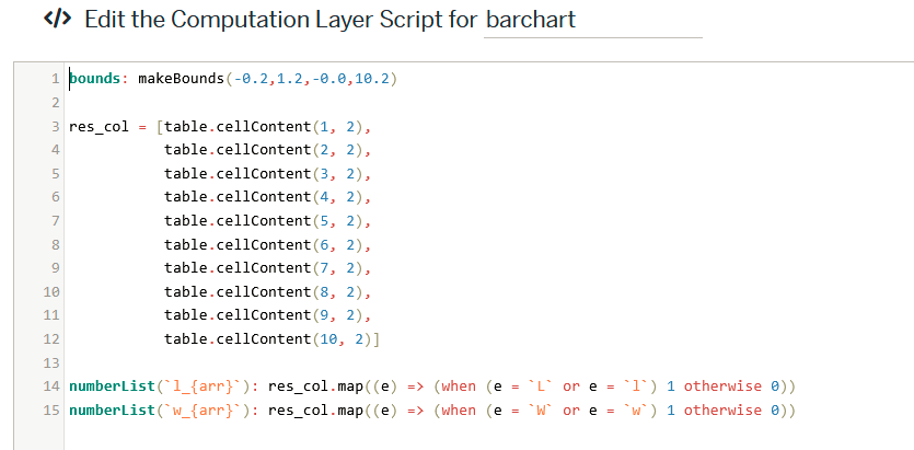
It just hard-codes ingesting the student data on the first page like so
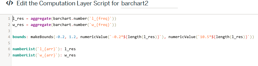
and then aggregates the totals on the next page
I avoided using the histogram function in the desmos graph since the aggregated data isn’t actually the original data, just frequencies from individual students ![]()
The graph can be found here, and calculates a t_{otal} variable, just because I was originally using this for doing relative frequencies rather than total counts.
Hope this helps! Someone more familiar with CL might know a cleaner way to do this